Finding 017/11
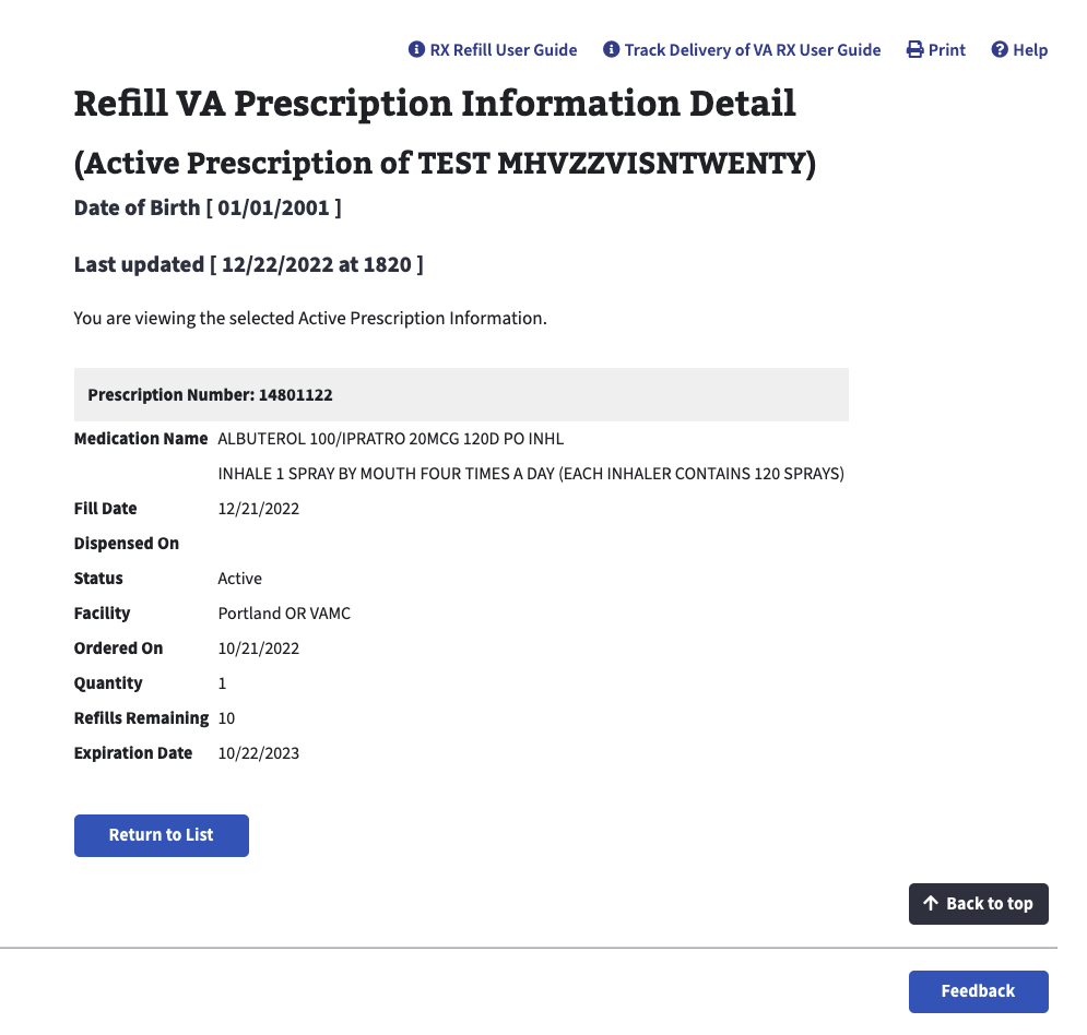
Misunderstood the expiration date
Most veterans thought the expiration date described the medication's shelf life rather than the prescription's refill eligibility.
Case study · 01
Two years of extensive research with Veterans shaped a complete redesign of the My HealtheVet Pharmacy tool. A user experience built for Veterans, by Veterans.
Focus
Research · UX Design · Product development
Scope
My work on the MHV Pharmacy tool covered several aspects of the online experience, including the prescription status redesign and a complete rebuild of the Prescriptions page, which displays an active and historical record of a patient's prescriptions. Much of this work was considered confidential, so this case study focuses on the prescription status redesign.
Research with Veterans · 01
We studied how Veterans interpreted refill and prescription statuses, where they looked for definitions, and whether new status tags gave them enough information to act with confidence.
Most veterans thought the expiration date described the medication's shelf life rather than the prescription's refill eligibility.
Most participants needed wayfinding guidance, and participants spent noticeable time scanning for the right definition.
Several participants referenced its existence, although the UI was unclear and there were varying responses as to what this information was about.
Seven veterans already understood the status, so deeper interaction did not necessarily indicate a design failure.
“I like how it's telling Veterans what's going on so vets don't have to reach out.”
Method
The team conducted in-person, moderated usability sessions at the Mount Vernon VA clinic. Veterans completed five task-based scenarios on a tablet, including refilling a prescription, interpreting statuses, finding definitions, navigating medication details, and explaining five different dates.
My contribution
Stakeholder presentation · 02
We translated the study into a stakeholder presentation that connected the research goals, usability evidence, and recommended product direction.
“The color tags look alive!”
What we set out to learn
Direction presented
Implement status tags and pop-ups, then reorganize the table around clearer information hierarchy.
Revisit the page layout and separate prescription status from refill status, with further testing for clarity.
Clarify date names and placement, with direct access to supporting definitions when Veterans need them.
Final status redesign · 03
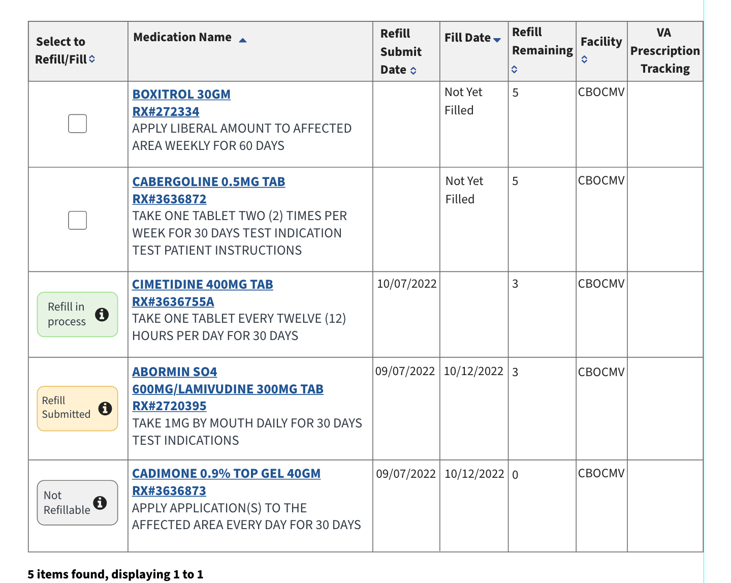
Comparison 01
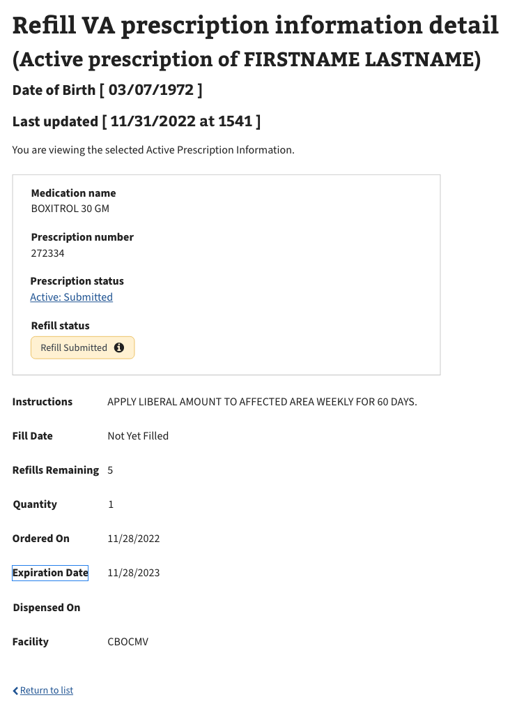
The redesigned table brings refill status into the main scan path with distinct tags and direct access to plain-language status help.
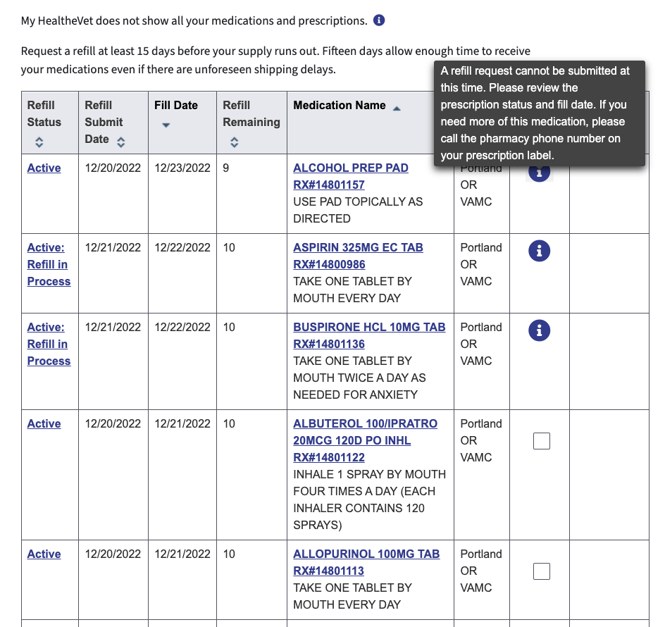
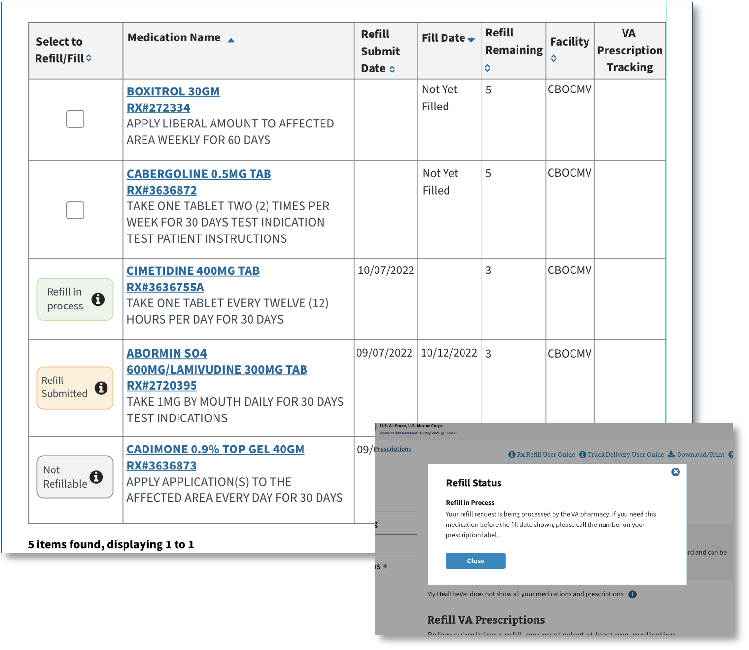
Comparison 02
The final page separates prescription status from refill status and groups the most important medication information into a clearer hierarchy.