Mindset 01
Efficiency seeker
Travels for work, packs light, uses modern services, and follows a strict routine to move quickly.
Case study · 02
A service experience and companion app that takes the stress out of flying.
Focus
Research · UX Design · Product development
Discovery · 01
The data I gathered suggested there were opportunities for a better experience within the TSA/security checkpoint, navigating the airport, and having access to useful information like wait times and food options.
View research paper29 responses
29 responses
29 responses
29 responses
Synthesis · 02
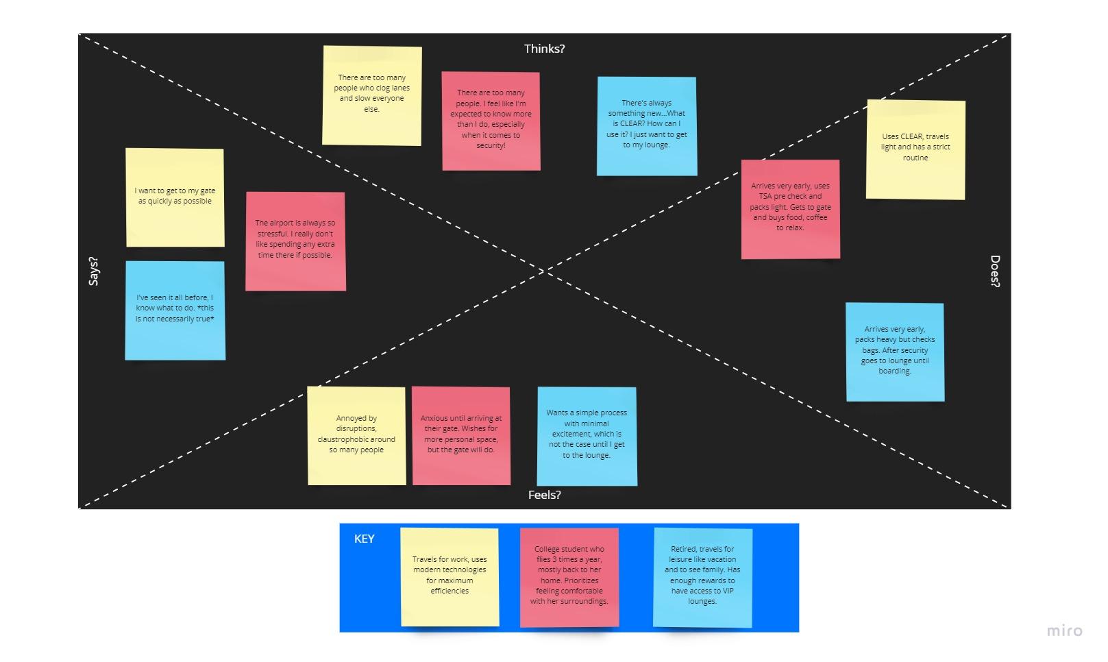
The interviews revealed that airport behavior changes with context. Anxiety peaks before security, then gives way to relief and a desire for food, work, or rest. Rather than flattening that experience into one persona, I mapped three distinct traveler mindsets across what they think, say, do, and feel.
Mindset 01
Travels for work, packs light, uses modern services, and follows a strict routine to move quickly.
Mindset 02
Flies a few times each year and relies on early arrival, familiarity, and personal space to feel prepared.
Mindset 03
Checks bags, arrives early, and values a simple path to lounge access and a calmer wait before boarding.
How research evolved the experience
Uncertainty creates stress before security.
Surface live security wait times and make the fastest route easy to compare.
Travelers want control without learning another complex system.
Center the experience on one trip dashboard with direct, task-based actions.
Needs change after travelers reach the secure side.
Shift from wayfinding to nearby food, retail, lounges, and saved locations.
Service mapping · 03
I mapped the full service journey across the three phases of the airport experience, connecting what travelers do, the Feather touchpoints they use, and what they think along the way.
Phase 01
“That was fast and clear.”
Explore phaseActions
Touchpoints
Phase 02
“Security should be really simple now!”
Explore phaseActions
Touchpoints
Note: managed on app
Phase 03
“There are a lot of options”
Explore phaseActions
Touchpoints
Exploration · 04
I translated the research into rough, testable paths before investing in visual polish. The wireflows focus on the two moments with the clearest research signal: finding useful places quickly and managing a trip with another traveler.
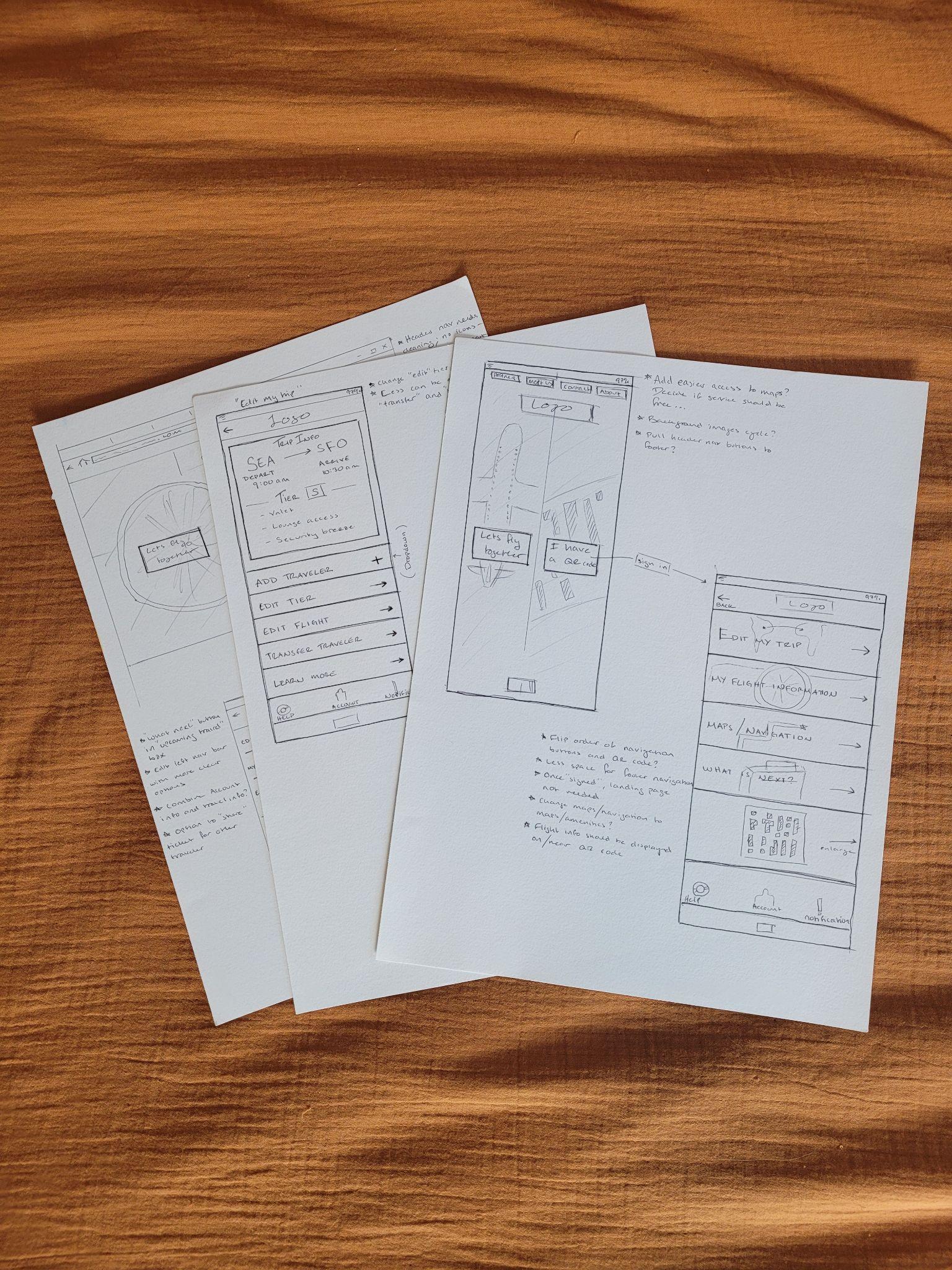
Early paper sketches helped me compare service tiers, trip information, baggage, parking, and lounge access as one connected airport experience.
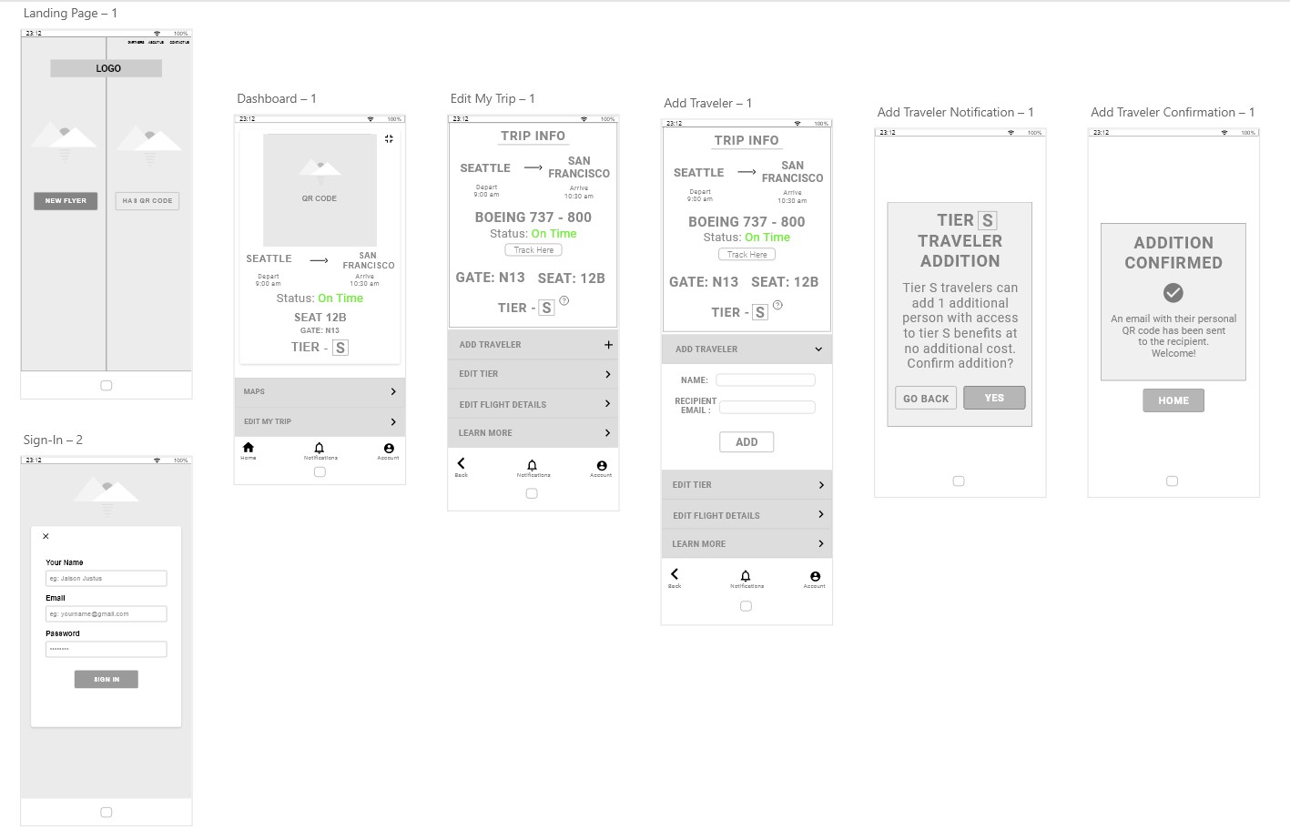
The add-traveler route tested how a user could extend tier benefits, enter a companion's details, understand the rules, and confirm the addition without leaving the trip context.
High fidelity · 05
Designing an inviting, efficient and robust app took many iterations and multiple rounds of testing. From guerrilla testing with sketches to 10 moderated user tests, the dashboard went through dozens of updates. After each test I changed the design to address the pain points users ran into.
Sketch
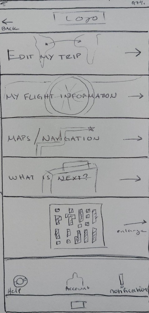
Iteration 1
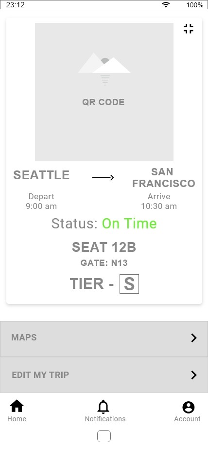
Iteration 2
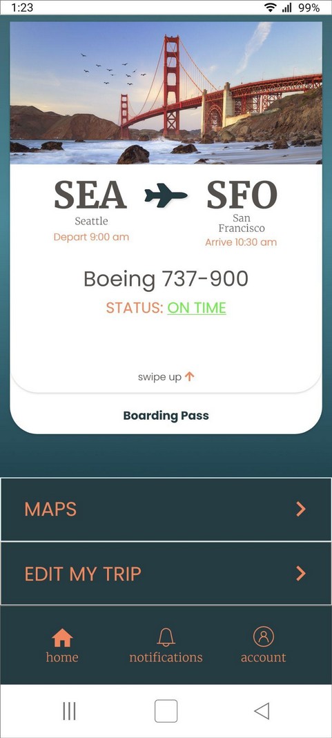
Final
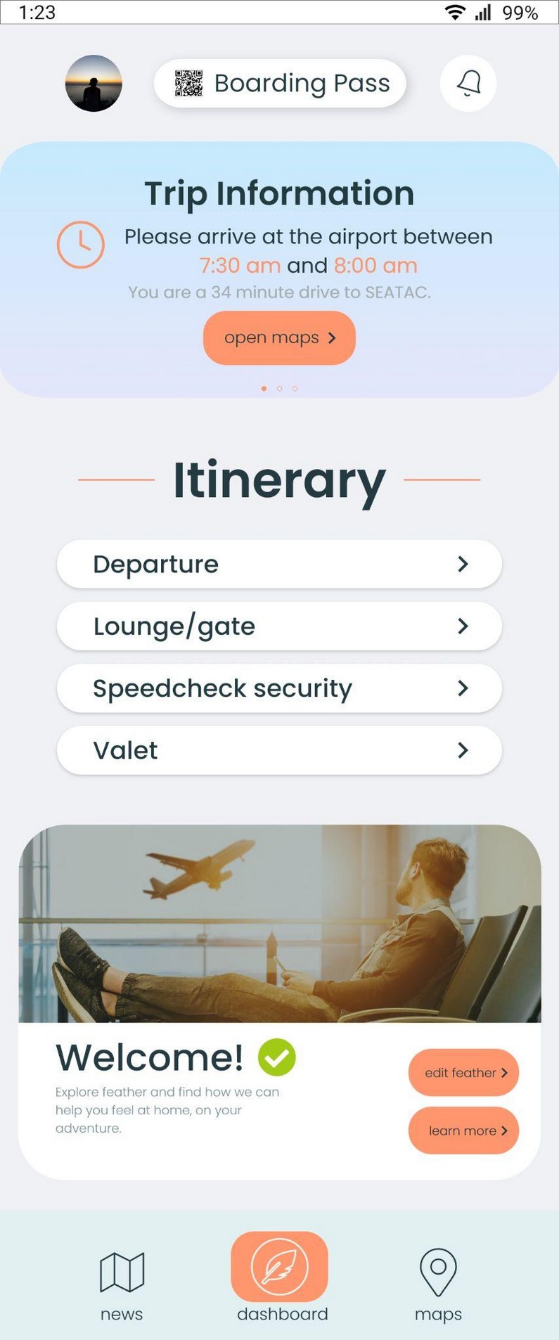
Change 01
Problem
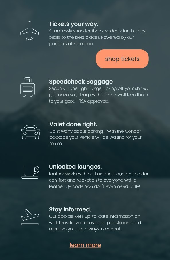
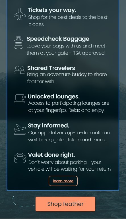
A text-heavy About Feather page made digesting information arduous and overwhelming.
Solution
Add spacing, tighten the copy, and move a larger call to action to the bottom of the page.
Before
After
Change 02
Problem
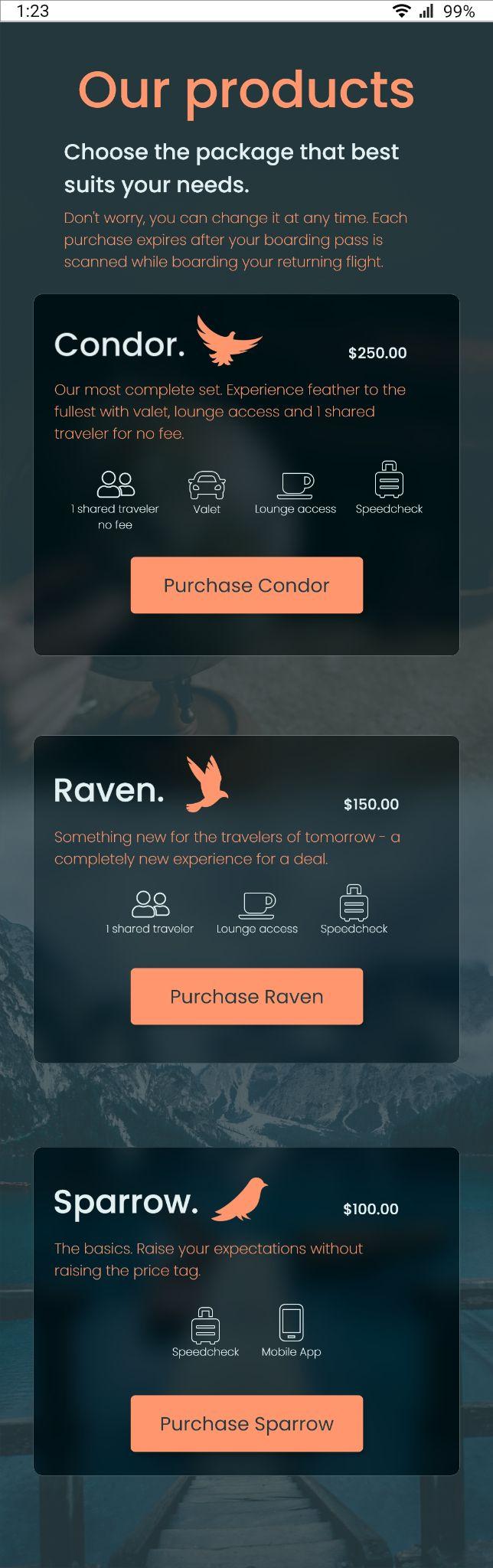
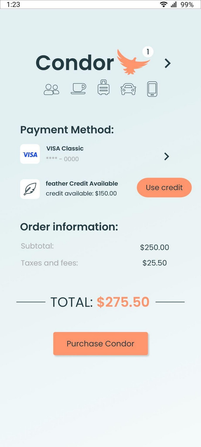
Users felt unsure about what Feather offered, even at the moment of purchase.
Solution
Edit copy, limit text, and add interactive icons so users can learn more about each included service.
Checkout
Change 03
Problem
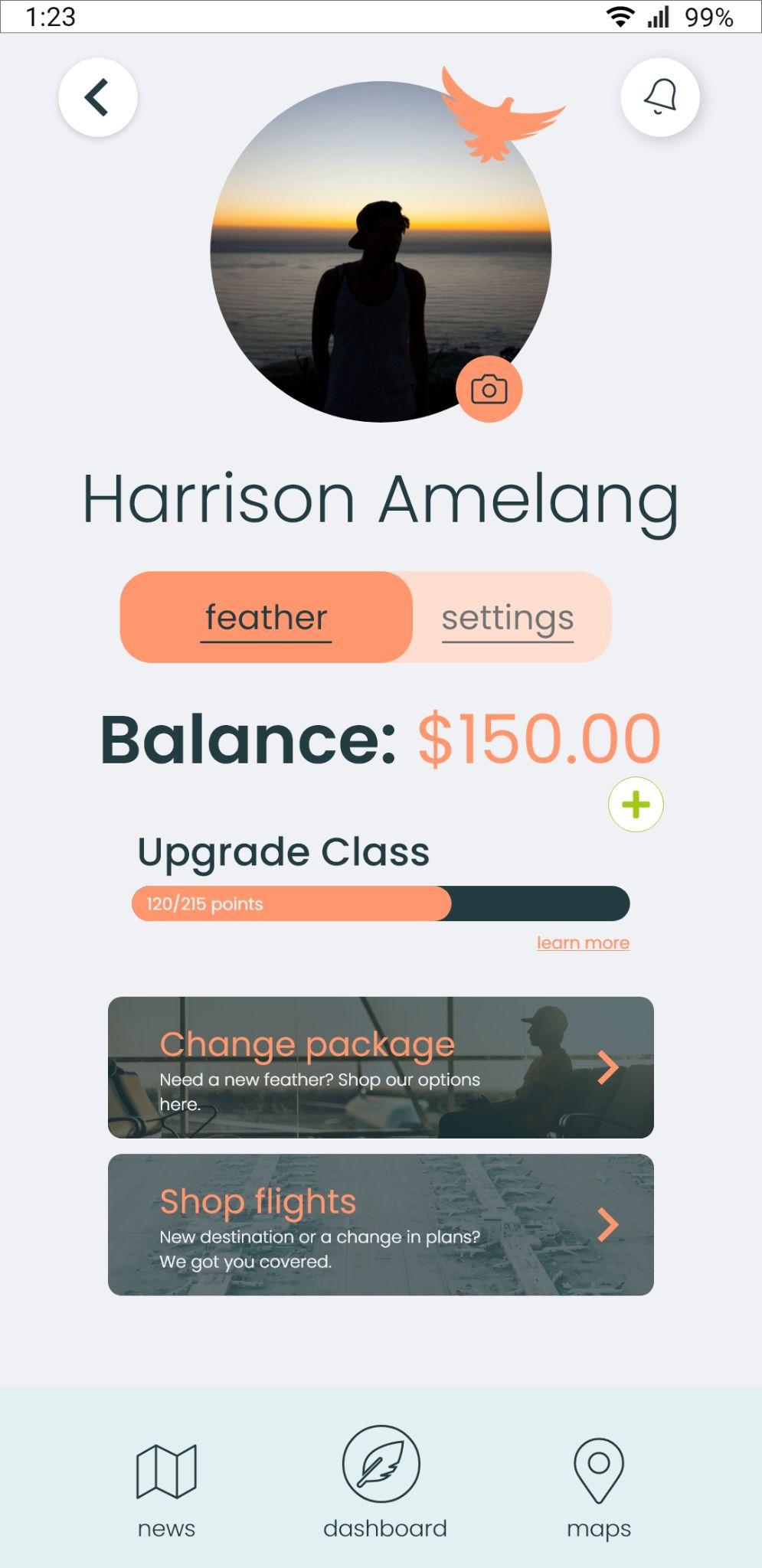
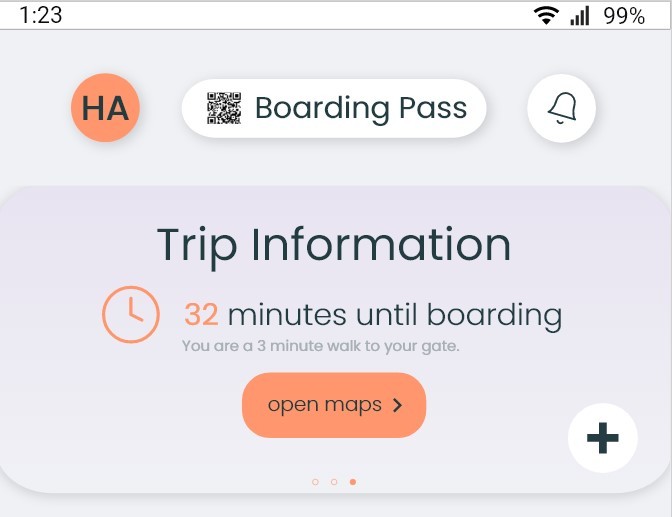
Users struggled to find the Account button without help.
Solution
Add a profile picture to the account button, enlarge it, and change the carousel color for better contrast and navigation.
Account button
Validation · 06
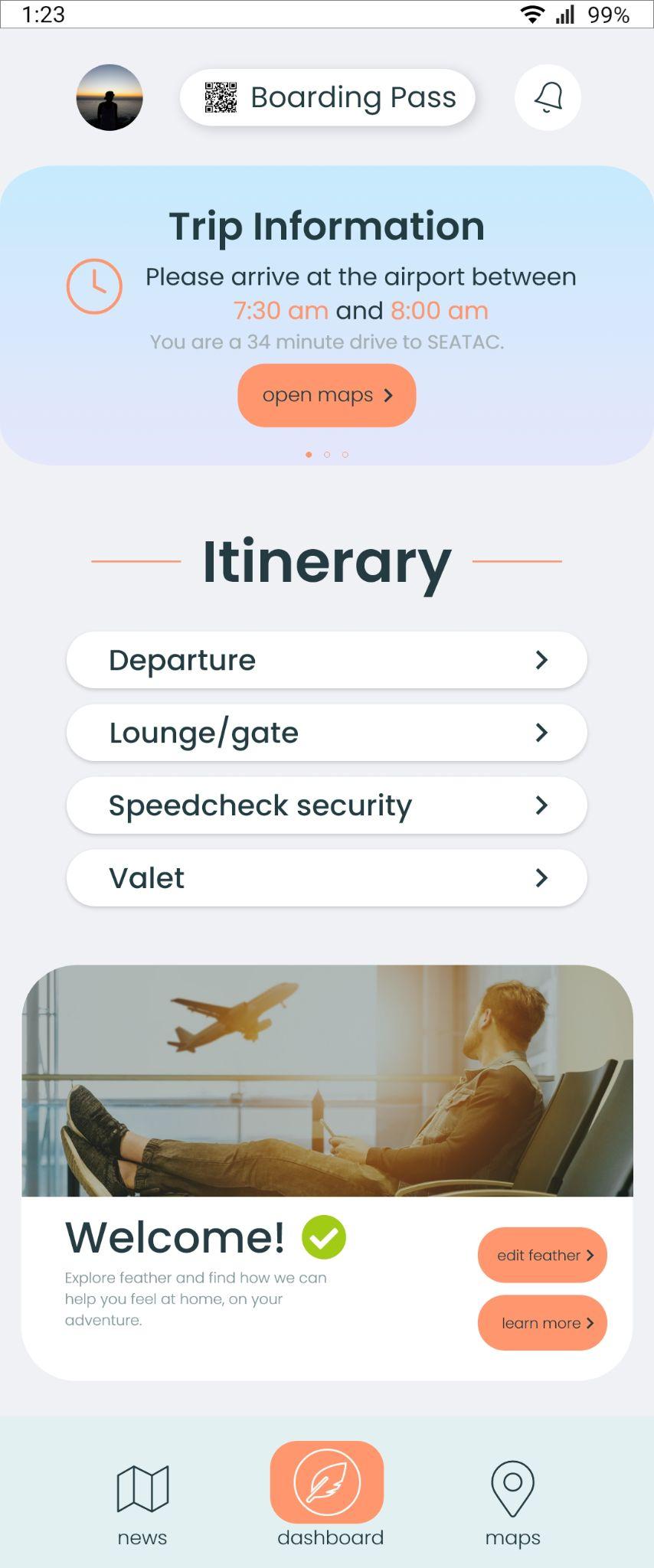
Feather became both a digital and physical experience: Speedcheck Baggage, lounge access, valet parking, shared travel, and a companion app that carries your boarding pass, itinerary, and airport map. Every feature traces back to the four interview insights around control, efficiency, personal space, and a sense of place.
user interviews conducted
moderated usability tests
insights that shaped the design
More work
Two years of extensive research with Veterans shaped a complete redesign of the My HealtheVet Pharmacy tool. A user experience built for Veterans, by Veterans.
A music app where the free tier feels generous and Premium feels worth it.