01
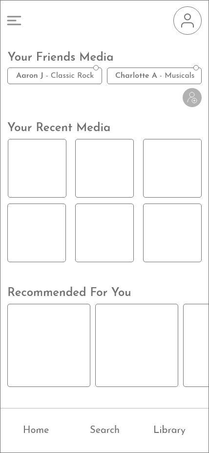
Premium homepage
The full experience: friends' media, recent media, and recommendations, all unlocked.
Case study · 03
A music app where the free tier feels generous and Premium feels worth it.
Focus
Research · UX Design · Product development

Competitive analysis · 01
My interviews focused on why people buy or avoid premium plans, not on price. I recruited 18 to 24 year olds already paying for competing services and compared how each competitor handles the jump from free to paid.
View full case studyinterviewees on Spotify Premium
on YouTube Premium
using both
on Apple Music
Spotify Premium
The benchmark. Its dark palette and familiar navigation set user expectations, so TuneUp mirrors those patterns to feel instantly recognizable.
YouTube Premium
Users upgraded to remove interruptions. Ad-free listening became the headline Premium benefit.
Pandora
Its free model works like a simple radio. TuneUp's free tier lets users interact with music instead, which testers called empowering.
Apple Music
Paid-only, so it showed what a fully personal library feels like and what free users should get a taste of.
"With no interruptions it feels much more like my app, my music and my own thing."
| Feature | Premium | Free |
|---|---|---|
| Access to 45 million songs | Included | Included |
| AI-generated personalized playlists | Included | Included |
| All podcasts, artists, and new releases | Included | Included |
| Like your favorite songs | Included | Premium only |
| Unlimited ad-free listening | Included | Premium only |
| Offline listening | Included | Premium only |
| Create playlists with friends | Included | Premium only |
Competitors' free tiers feel like radios. TuneUp's opportunity was to give free users real control, then let Premium add what they ranked highest: no ads, offline listening, and shared playlists.
Exploration · 04
The low fidelity screens used industry standard layout and navigation so testing could focus on the freemium to premium experience.
The full experience: friends' media, recent media, and recommendations, all unlocked.
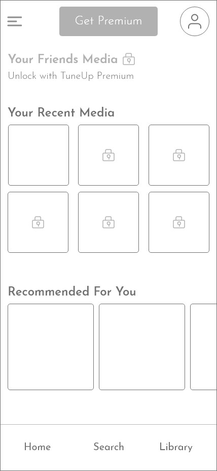
Every Premium feature appeared but locked behind a grayed-out icon to tempt upgrades. Guerrilla tests showed it cluttered the screen and confused users.
High fidelity · 05
The high fidelity UI revolves around making the path from free to Premium easy and inviting. A strong black background with a bold orange mirrors Spotify's familiar dark palette, lets album art pop, and marks Premium features: the more orange you see, the more personalized TuneUp becomes.
Customization
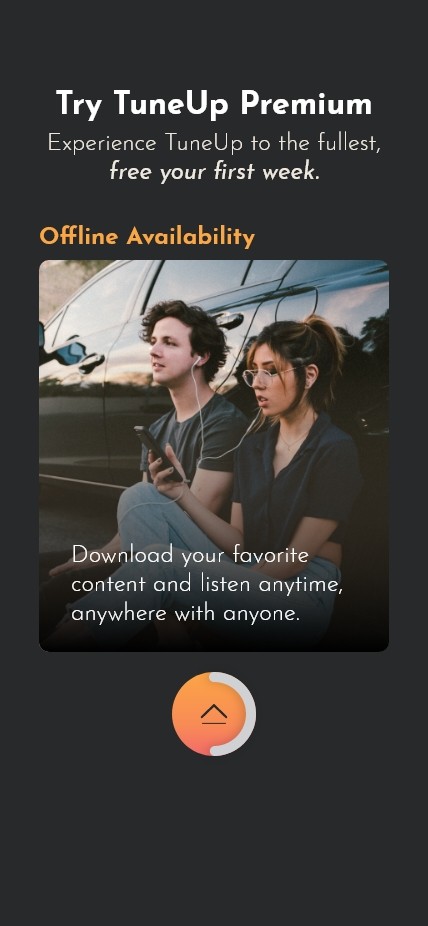
Offline
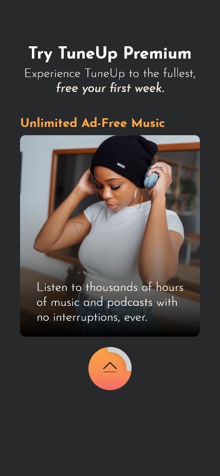
Ad-free
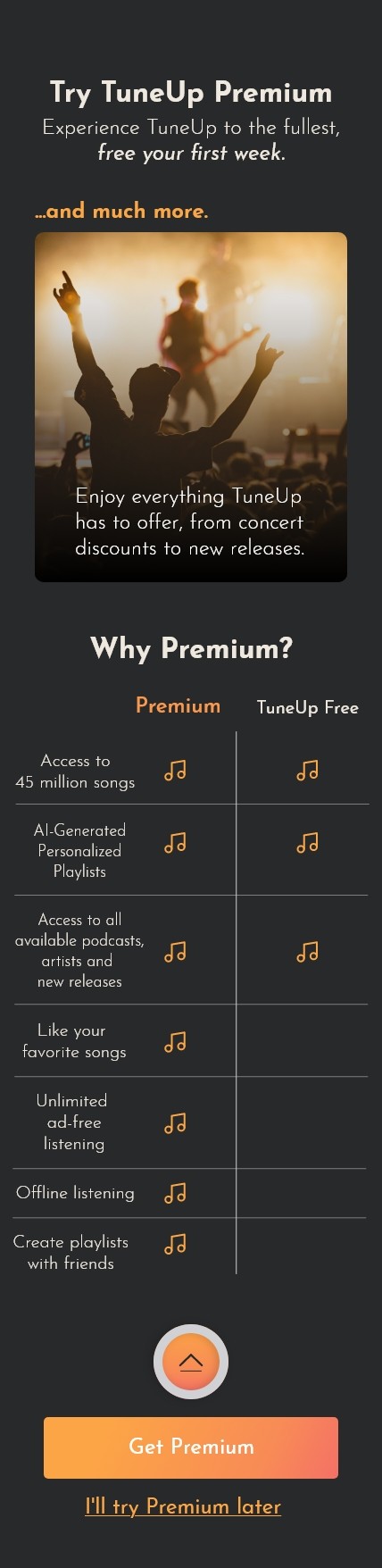
Why Premium?
Change 01
Problem
Testers skimmed the onboarding cards, one saying important Premium information should be findable elsewhere.
Solution
Add a final Why Premium? screen with a clear side-by-side comparison, so the value is easy to read once more before onboarding ends.
Why Premium?
Change 02
Problem
Telling free users what they were missing felt restrictive, while competitors' free tiers feel like passive radios.
Solution
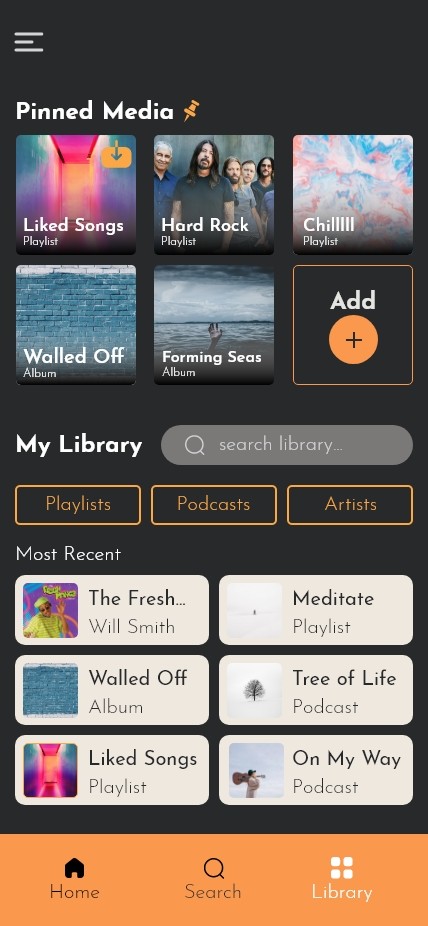
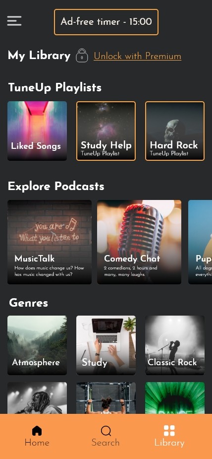
Empower the free tier: TuneUp playlists, podcasts, genres, and an ad-free timer, while Premium adds a personal library with pinned media and filters.
Free
Premium
Change 03
Problem
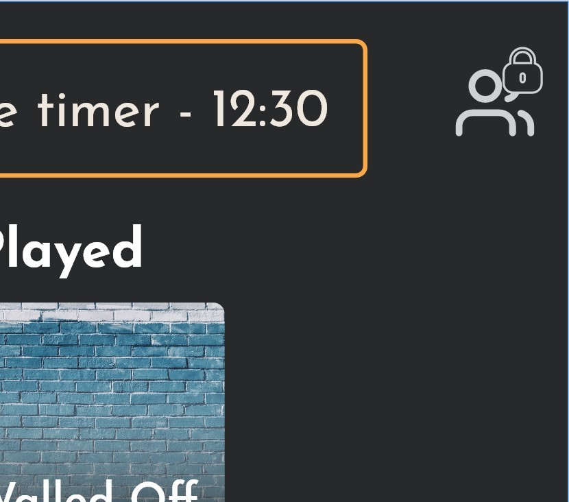
Locked icons and labels on Premium elements were distracting and unimportant to users.
Solution
Show, don't tell: remove the lock element entirely in the final iterations.
Removed lock
Validation · 06
After testing, every participant said they would be drawn to buy Premium, and 4 of 5 said the positive free experience and amount of content would be the reason. The design empowers free users instead of reminding them what they are missing.
people screened
in-depth interviews
cited the free experience as a reason to upgrade
More work
Two years of extensive research with Veterans shaped a complete redesign of the My HealtheVet Pharmacy tool. A user experience built for Veterans, by Veterans.
A service experience and companion app that takes the stress out of flying.